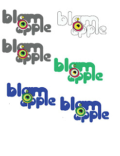
My logo that I am designing for the company that I decided to call Blamapple, is having a little trouble as of now,but consists of these ideas:
- Negative space is to act as a lolly pop stick for the apple symbol. This is to give a subtle connection between healthy fruit and vegetables and candy
- The bowls of the letters are to mimic the eye shapes of the characters that I developed
- The eye in the apple to to make it come alive, like the characters convince children to eat their fruits and vegetables because of their activation.
the colors are what I am struggling with as of now. The actual lunch boxes are going to be very colorful as they are, and i don't want to overpower them.

2 comments:
I like this new configuration of your logo. I do wonder if the apple in the middle is a little too big? It seems to be covering up a little too much of the words.
As far as coloring goes, maybe using that one that is outlined and then just filling it with a contrasting color to your lunchboxes. You could have quite a few different colors because the type and illustration style is so unique. But keeping that black outline will unify with your characters as well as with the little apple drawing in the middle.
Check out this identity system that Nikki found: http://blog.lib.umn.edu/ande7976/dha3352/63e06b6df66259c2.jpg and that Ellie found: http://www.designsitesup.com/images/identity_design___best_id/best_letterhead__business_cards____envelope_design/42152d804efa25a2.jpg. Both are inspirational and related to your identity style.
Post a Comment