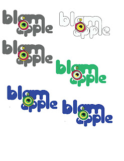
My logo that I am designing for the company that I decided to call Blamapple, is having a little trouble as of now,but consists of these ideas:
- Negative space is to act as a lolly pop stick for the apple symbol. This is to give a subtle connection between healthy fruit and vegetables and candy
- The bowls of the letters are to mimic the eye shapes of the characters that I developed
- The eye in the apple to to make it come alive, like the characters convince children to eat their fruits and vegetables because of their activation.
the colors are what I am struggling with as of now. The actual lunch boxes are going to be very colorful as they are, and i don't want to overpower them.
